RGB vs CMYK
What's the difference between RGB and CMYK?
Both RGB and CMYK are colour modes using for mixing colours when creating a design, although the way they are mixed is completely different to create the required pigment. Both options start with three primary colours which are blended together to make all other available colours, but otherwise the processes are almost opposite of each other.
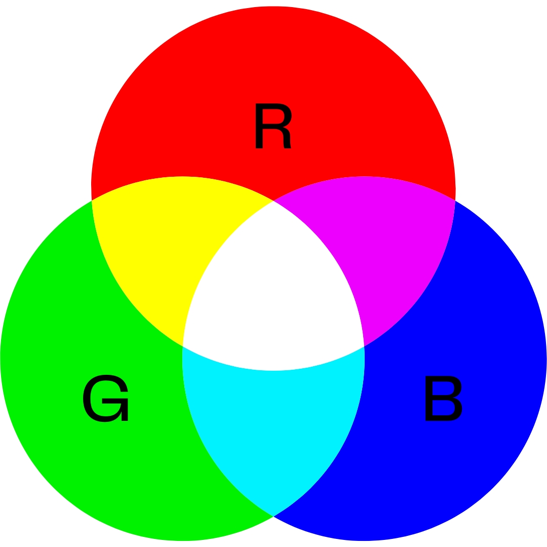
RGB (Red, Green, Blue)
RGB is the colour mode used for digital designs, where the final product is going to be viewed on a screen e.g. website, tv, mobile phones. This colour mode use red, green and blue as its primary colours, using light to define colour which is why it is best used where light will come through the device behind the colour. Digital screens have red, green and blue bulbs emitting at different levels to display the pigmentation of colours. These bulbs mimic the red, green and blue receptors in our eyes. Each light radiates at an intensity between 0 and 255. If red and green and blue are mixed together in equal amounts at full intensity this create white lights, whereas if red, green and blue are absent it creates black.
This colour process is known as an additive process. The more light that is applied the lighter the colour, less light means a darker colour.
|
  |
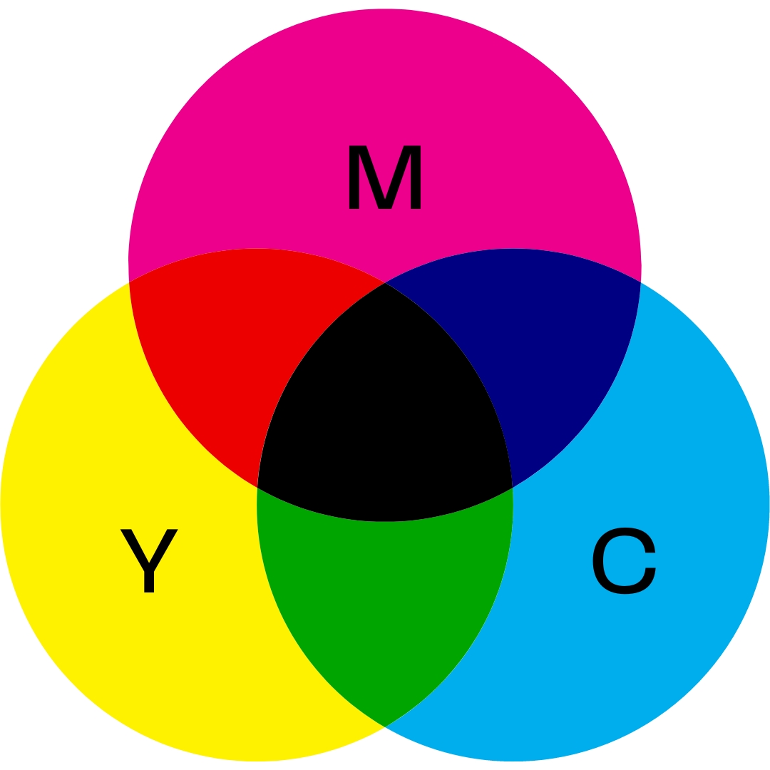
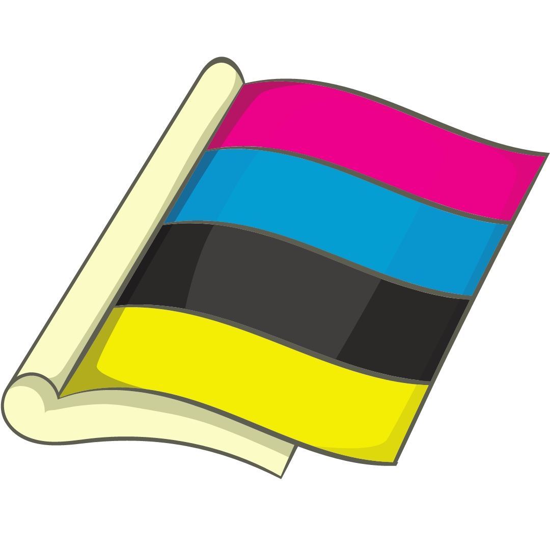
CMYK (Cyan, Magenta, Yellow, Black)
CMYK is the colour mode best use for printed products, both small and large format. CMYK stands for cyan, magenta, yellow and black. This colour mode mixes pigment and layers together to create colour, in the same way you mix blue and yellow paint together on a brush to create green. The pigments are mixed and applied to the printed media where light will shine onto the surface.
This is known as a subtractive process. Less ink applied to the material resutls in a lighter colour, more ink means a darker colour.
|
  |
Why is it important to send your artwork in CMYK?
Designing your artwork in the correct colour mode is really important, because it will effect how your final design looks. Designing in CMYK for printed materials is the best option and what we would always recommend when purchasing one of our printed displays. This allows the printers to accurately create the colours in your design.
Using RGB for artwork that will be printed will often result in the colours not matching what you see on screen, and will often appear more dull that what you were expecting. This can be very important when your representing your brand, as something as simple as the colour mode chosen when designing can impact whether your logo or branding will print in the correct colour to match with your corporate colour.
At Go Displays we use 1200 dpi printers with CMYK water based inks, to give the highest quality finish available. Although we do check all artwork files we receive for colour and image quality before printing it’s crucial that you make sure your design is supplied in CMYK to avoid any possible issues with printing or the final product.
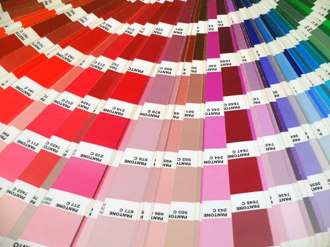
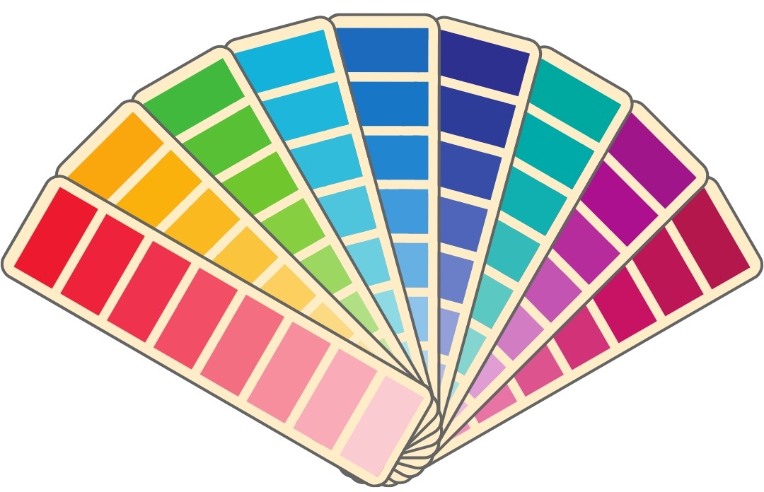
What is a Pantone colour?
Pantone Colours are a universal colour matching system that is used around the world by many different industries as a way to identify a colour. The colours are each given a unique number (known as a PMS number e.g. PMS 125). There are currently 1867 solid colours within the recognized Pantone colour system, each given a 3 or 4 digit number with the letters U (uncoated), C (coated) or M (matte).
If a company has a specific colour that is used in all their branding, perhaps a signature colour that the brand is known for or easily recongised because of, it is highly likely to be a Pantone Colour. This would allow all materials to display the same colour to guarantee consistency.
The Pantone Colour System (Pantone meaning ‘all colours’) allows graphic designers and printers to see exactly what colour the design should be when compared to the pantone reference.